Next
I led the debit card and unboxing work end-to-end: presenting concepts and progress to HSBC leadership and internal stakeholders, securing alignment on manufacturing investment, and partnering with debit card suppliers to specify a distinctive first physical card for alpha and beta testers—then iterating through research and sampling to the launch card customers received.
I stayed hands-on throughout—craft, app card surfaces, quantitative testing, and packaging—so the physical experience matched the product ambition and held up in market.
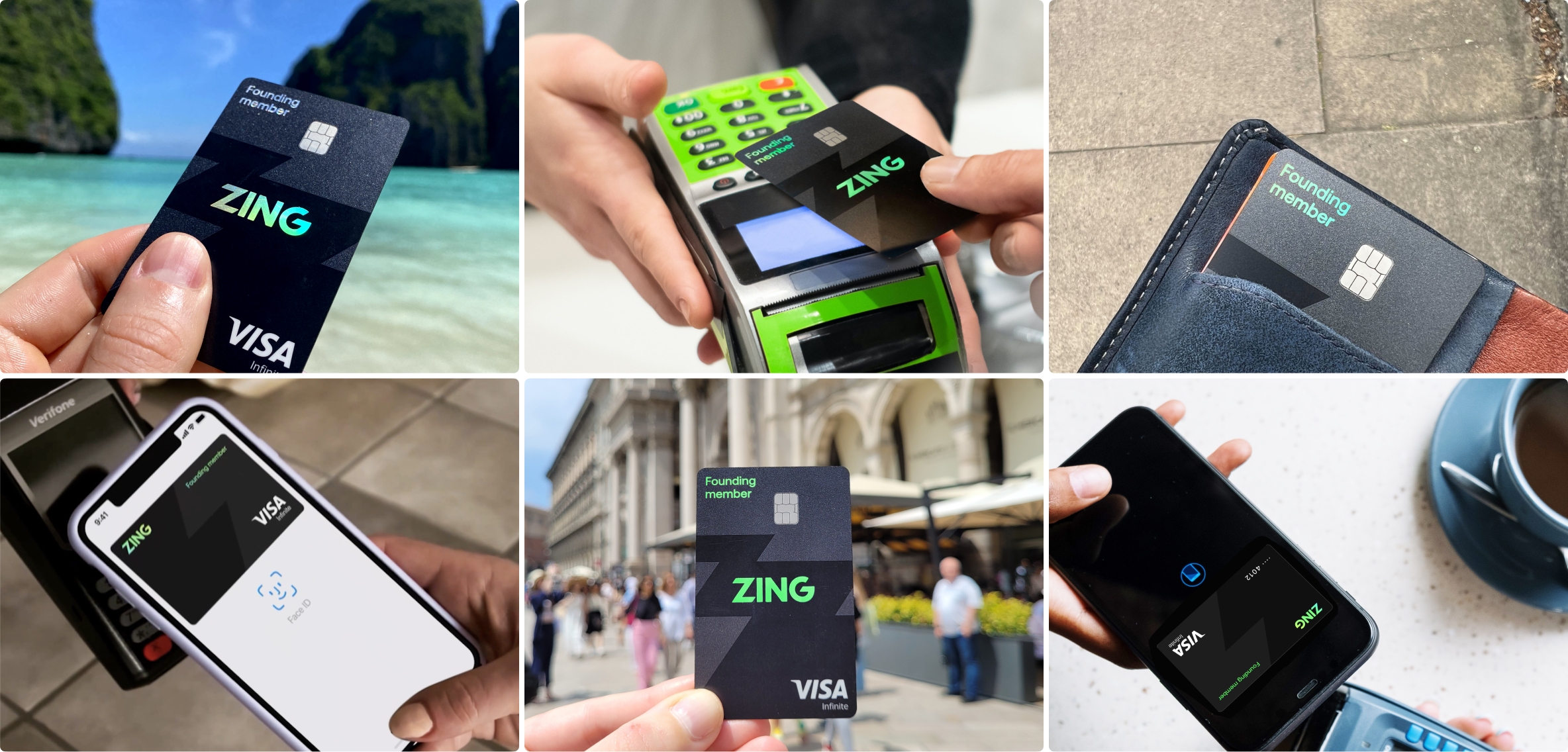
In Founding we needed a real card—not the final retail design yet—to run the early app end-to-end with alpha and beta testers. With card partners we pushed a holographic, purple-forward direction so we could exercise virtual and physical flows, wallets, and multi-currency behaviour on real plastic.
What follows is that first generation: the reveal, the capabilities we wired into early builds, and the in-app card surfaces we tested—before the separate body of work on the launch card below.
Virtual and physical cards
Digital wallet integration
Innovative holographic base
Instant card locking
Multi-currency sweeping
Once we had confidence from that founding exploration, I led the design of the debit card we would take through research, leadership sign-off, and manufacturing—the card customers would actually receive. This was a distinct chapter from the beta hardware above: new concepts, quantitative testing, physical sampling, and the final specification.
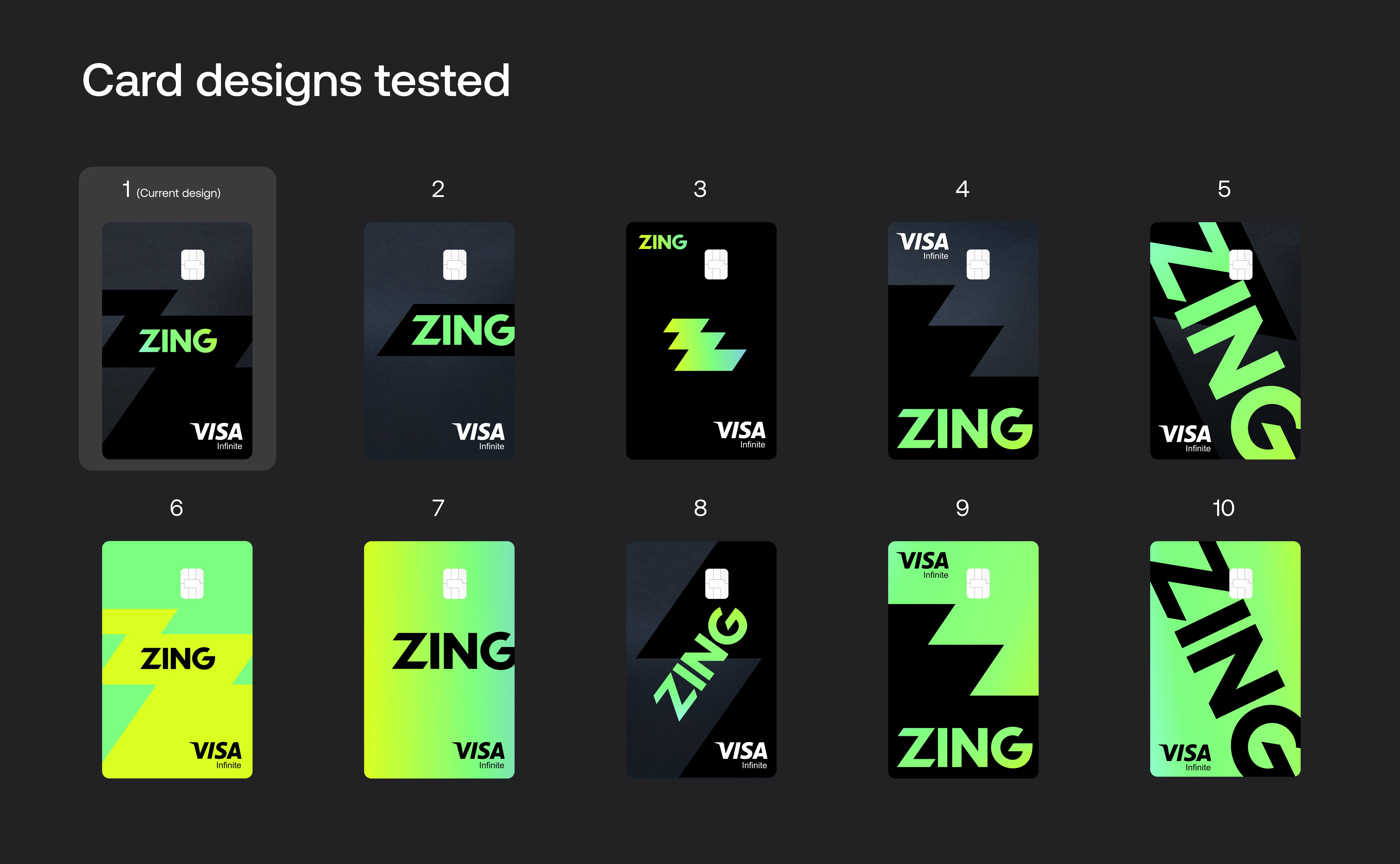
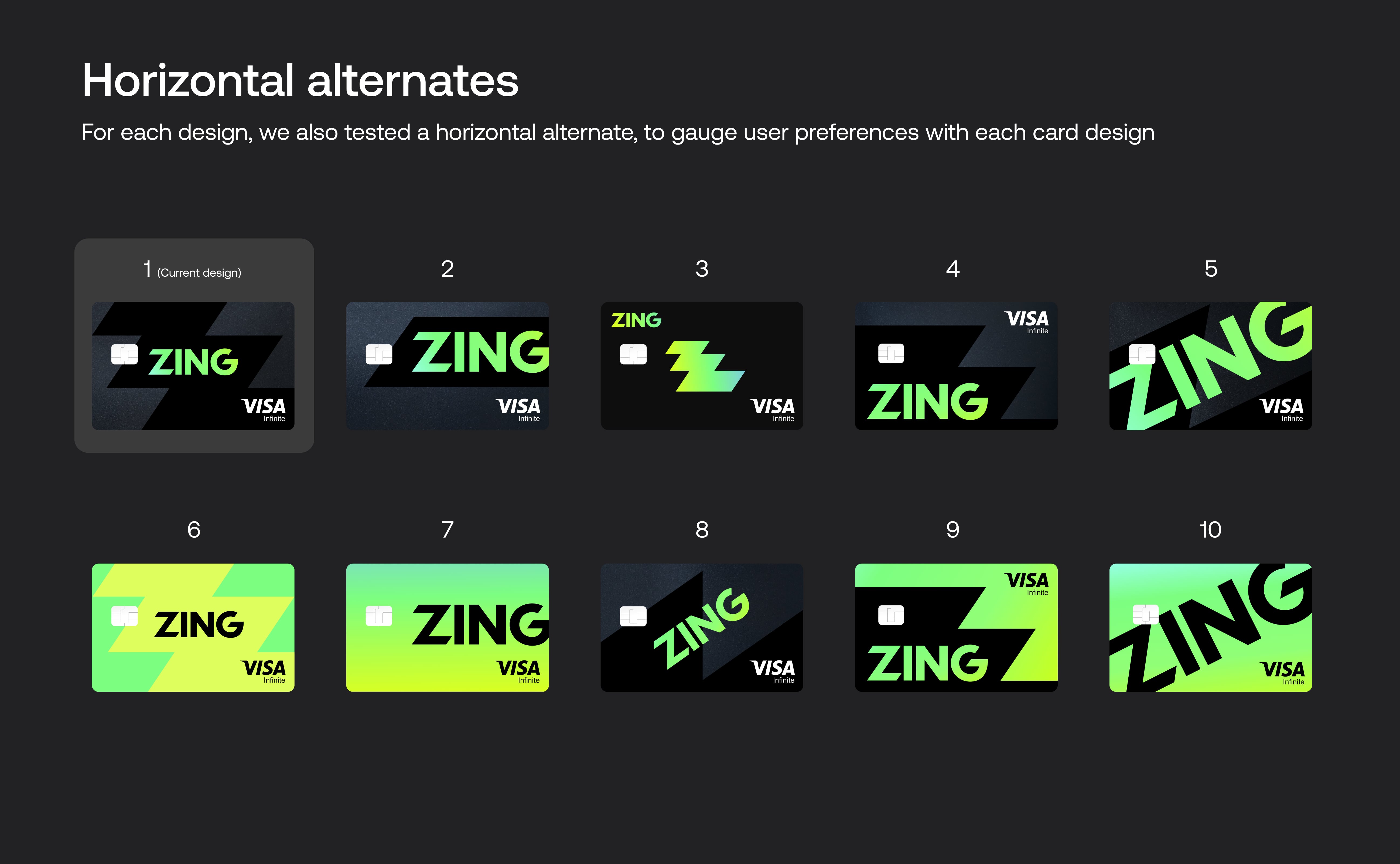
I designed a global multi-currency debit card that pushed the boundaries of card manufacturing. Starting with a wide range of concepts, we narrowed down to 10 final designs tested in both vertical and horizontal orientations. Through quantitative research, I analysed results across key metrics including Appeal, Premium, Trust and Uniqueness, with a focus on frequent travellers.
After presenting the highest performing designs to leadership and gaining budget approval, we moved forward to physical sampling. Working closely with manufacturers, we explored every detail including the holographic logo, pearl base finish, accessibility notch and hidden CVV, where real-world feedback informed our final design.
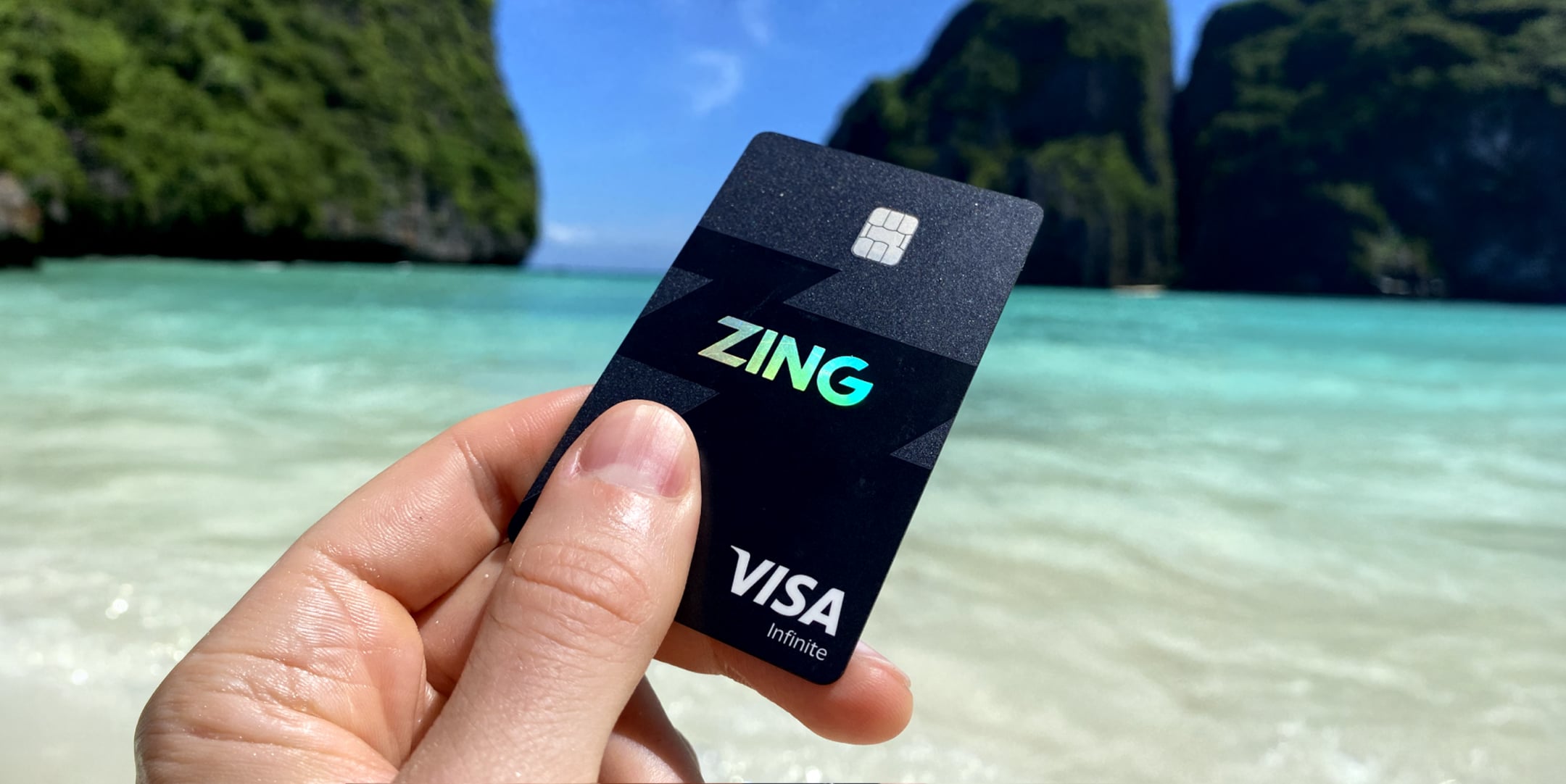
Holographic logo
Pearl base and metallic sparkles
Hidden CVV for security
85% recycled plastic
Custom vertical layout
Apple and Google Pay
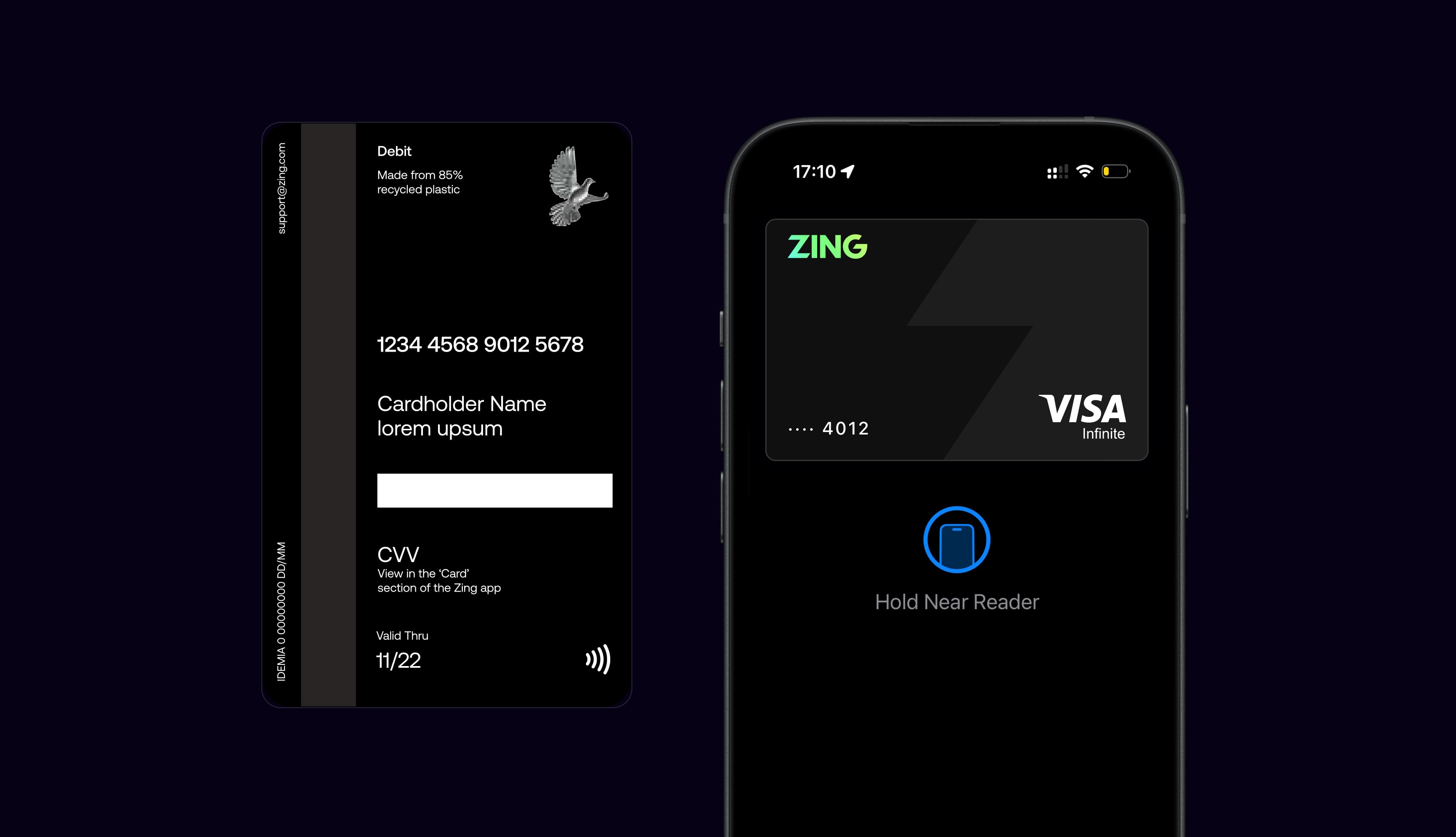

We designed an accessibility notch on the physical card to help users with visual impairments easily orient the card in the right direction. The small semi-circular cut-out on the bottom edge provides a tactile reference point, making it simple to identify which way is up when inserting the card into terminals or ATMs.
I ran a survey across the 10 final designs, each tested in both vertical and horizontal orientations. Personally analysing the quantitative results, I broke the data down by traveller frequency, gender, income brackets, age ranges, and key focus markets to uncover insights that would inform our design decisions.
The main metric we tracked was a net uptake score. This was calculated by capturing each user's preferred design and their least preferred design. By deducting the number of times a design was selected as least preferred from the number of times it was selected as favourite, we calculated this metric.
The main user segment we were designing for was the frequent traveller group, for which our chosen card design performed highest. We also considered several other key metrics such as Trust and Premium feel, which are explained in more detail further down.
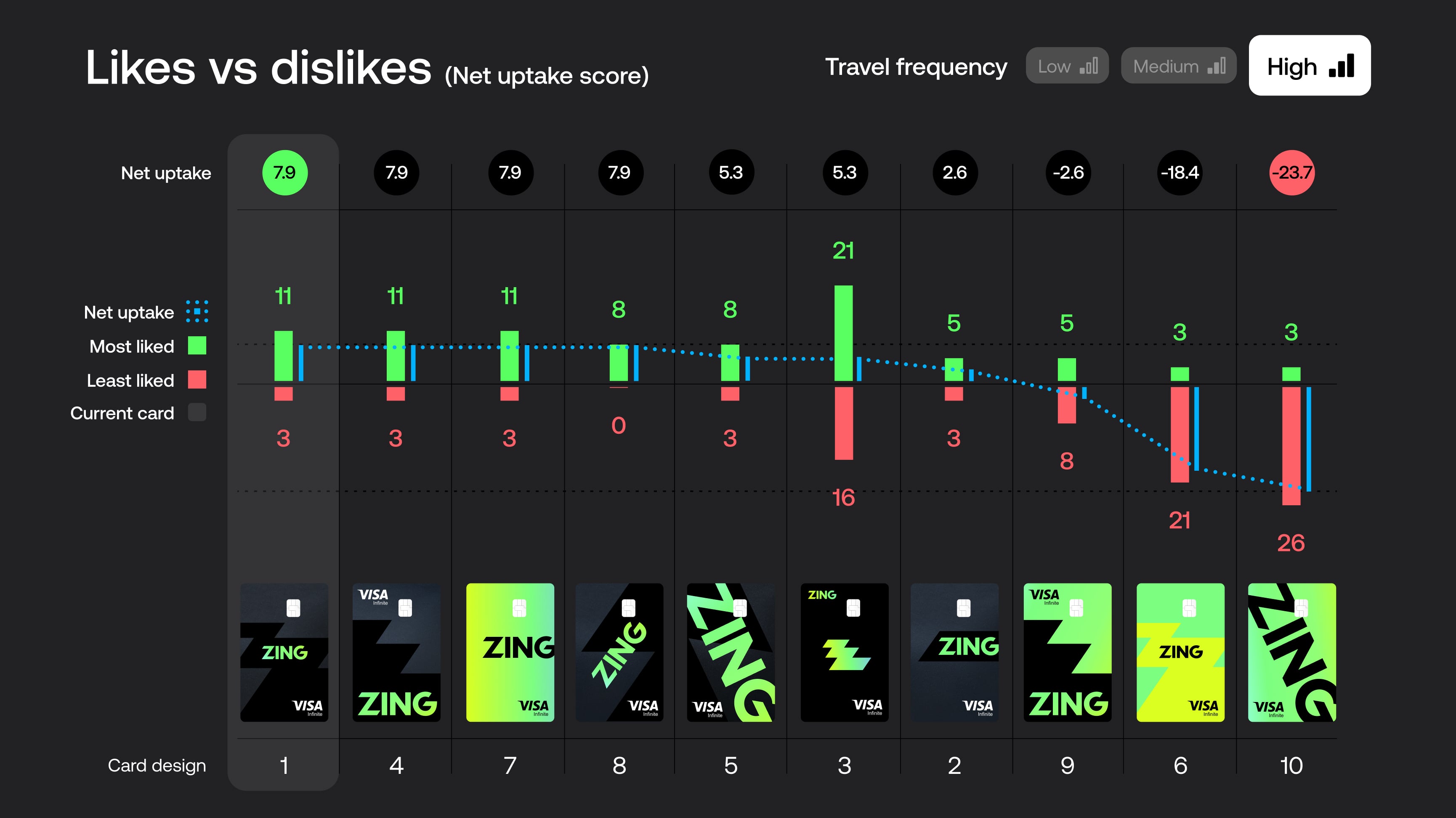
Beyond net uptake, we tested four additional key metrics: Appeal, Premium, Uniqueness and Trust. These were extremely important factors we were designing for.
Our chosen card design performed highest in Appeal and Trust, and a close second on Premium feel. The chosen card was lower on Uniqueness, so we monitored other designs closely which scored highly in this area and moved these on to physical testing stages too.
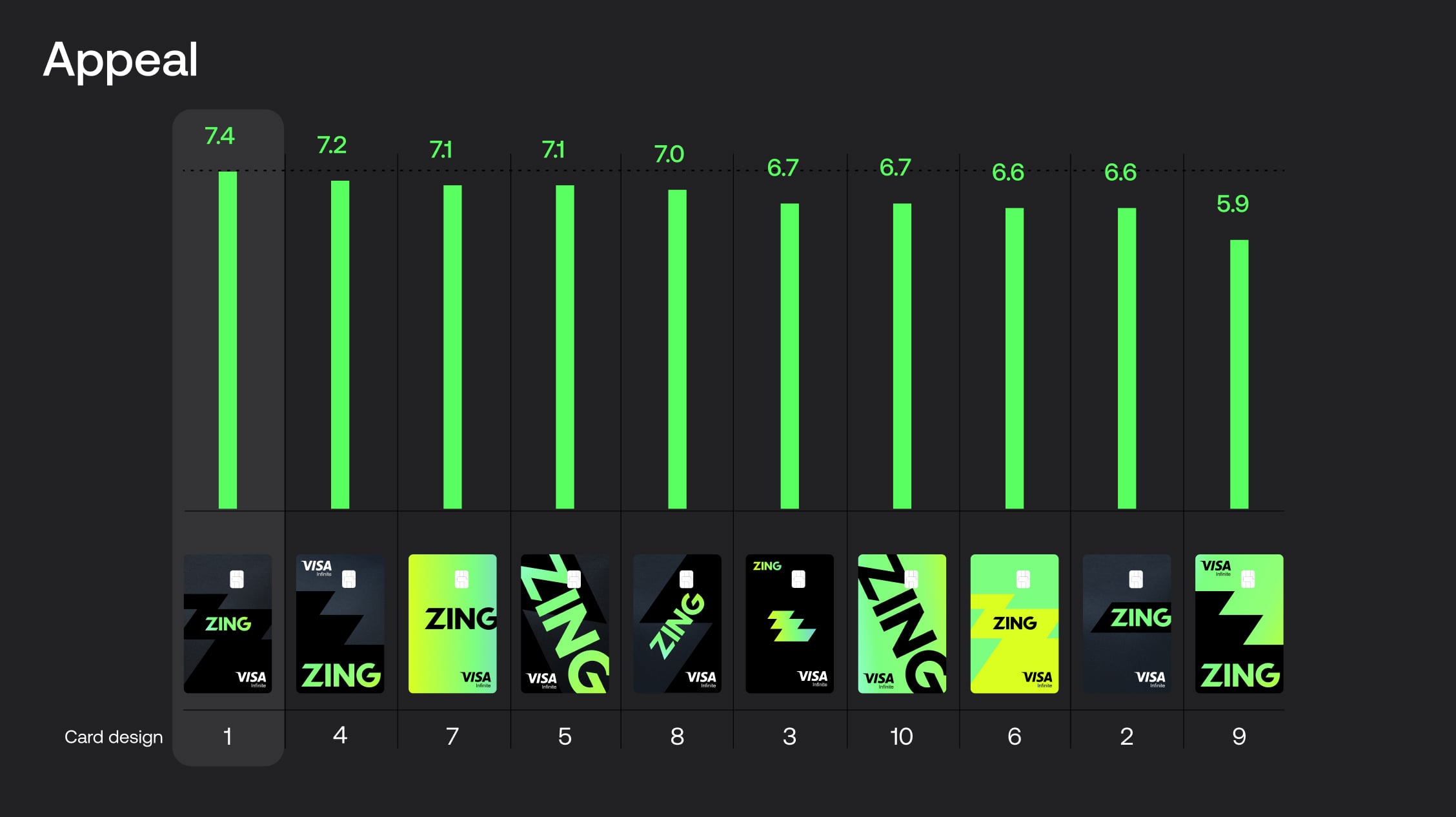
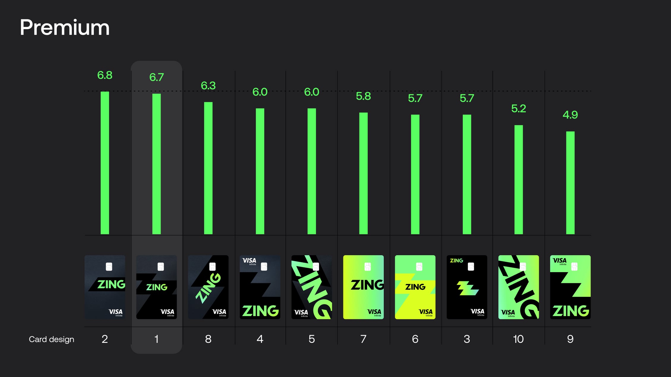
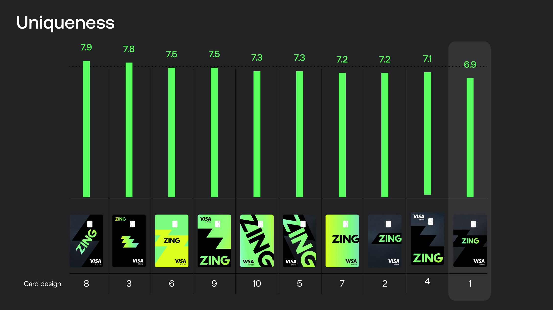

The card we had chosen to go forward with, while it didn't test highest on the overall net uptake score, it tested highest on our main key metrics of Appeal, Premium and Trust. We chose to move the other highest performing cards on to physical card testing too, to investigate those further in real life.

Building on our initial validation, we expanded our beta testing to include friends and family networks. This broader testing phase allowed us to gather diverse user feedback, test scalability, and refine our product-market fit before the public launch.
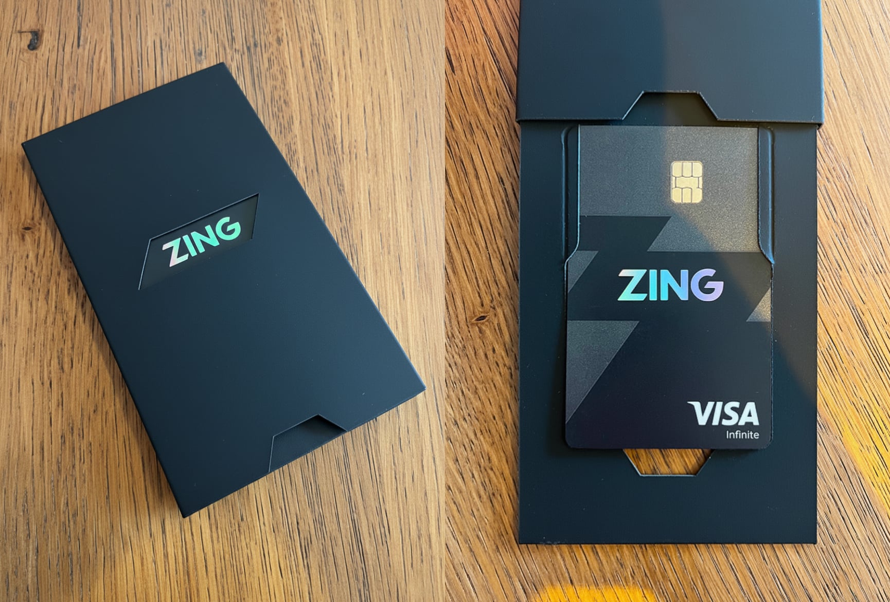
I personally designed the debit card packaging, looking to create an impactful unboxing experience that feels unique, differentiated, and memorable for customers. The goal was to craft an experience so impactful that customers would enjoy it and share it with friends.
I worked closely with our packaging manufacturer to push the limits of what was possible with the packaging, creating a unique branded experience with diecuts of the logo to reveal brand messaging that animates through the window as the pack is opened, revealing setup instructions and the debit card popping out into the customer's view. This exciting reveal creates a moment of delight, and customers frequently left reviews expressing their delight with this experience and the card and package unboxing experience overall.
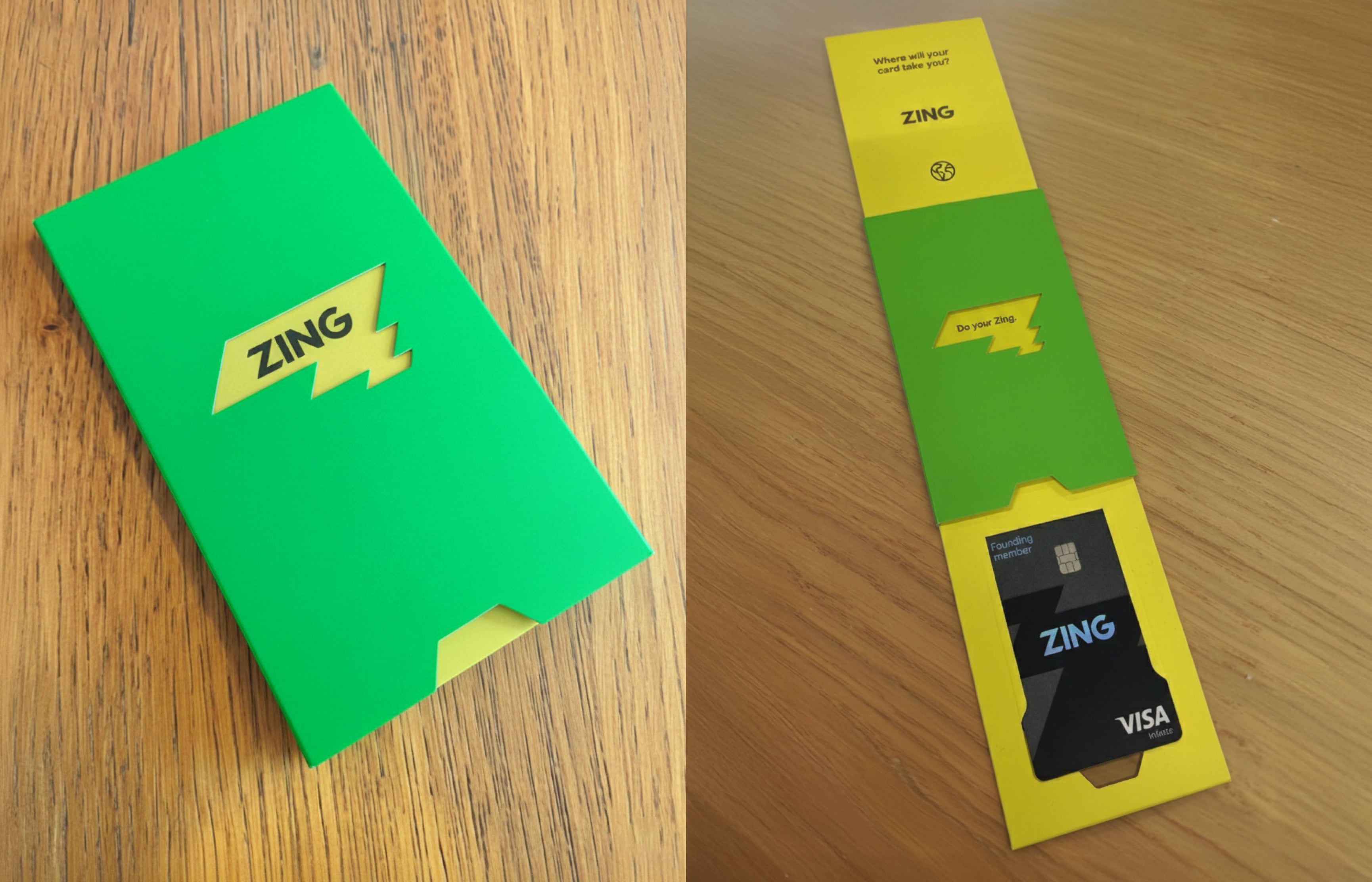
"Hands down the nicest experience getting a new card, ever. Didn't expect the packaging to slide out like it did, super nice touch."
"Card came in really cool packaging."
"Finally got around to applying for a Zing card. Application all through the app and completed within a few minutes, card available in mobile wallet straight away and then this impressive package a few days later."
Following customer feedback highlighting visual inconsistency between the packaging colour and the card itself, I explored an optimisation of the packaging to optimise more heavily for a premium feel. I chose a special soft touch board, exploring an environmentally friendly option that allowed us to display the FSC logo, and also included a QR code activation helping to boost card activity rates. This pack felt a lot more consistent with the card's design, and more sleek overall. I also simplified the diecut slightly to avoid some creasing from delivery which customers were reporting when the card arrived.
I positioned the layer which the card was on to be a layer above so the card's holographic logo is directly showing through the diecut area. This helped ensure consistency of the look, and also increase the impact of the reveal when the customer realises that the packaging is actually displaying the card. Then showing a full hologram flood when the pack is fully opened, helping to dial up the impact as the customer sees a holographic flash reveal. I also added the payment wallet instructions and logos helping to boost digital wallet activation.