Next
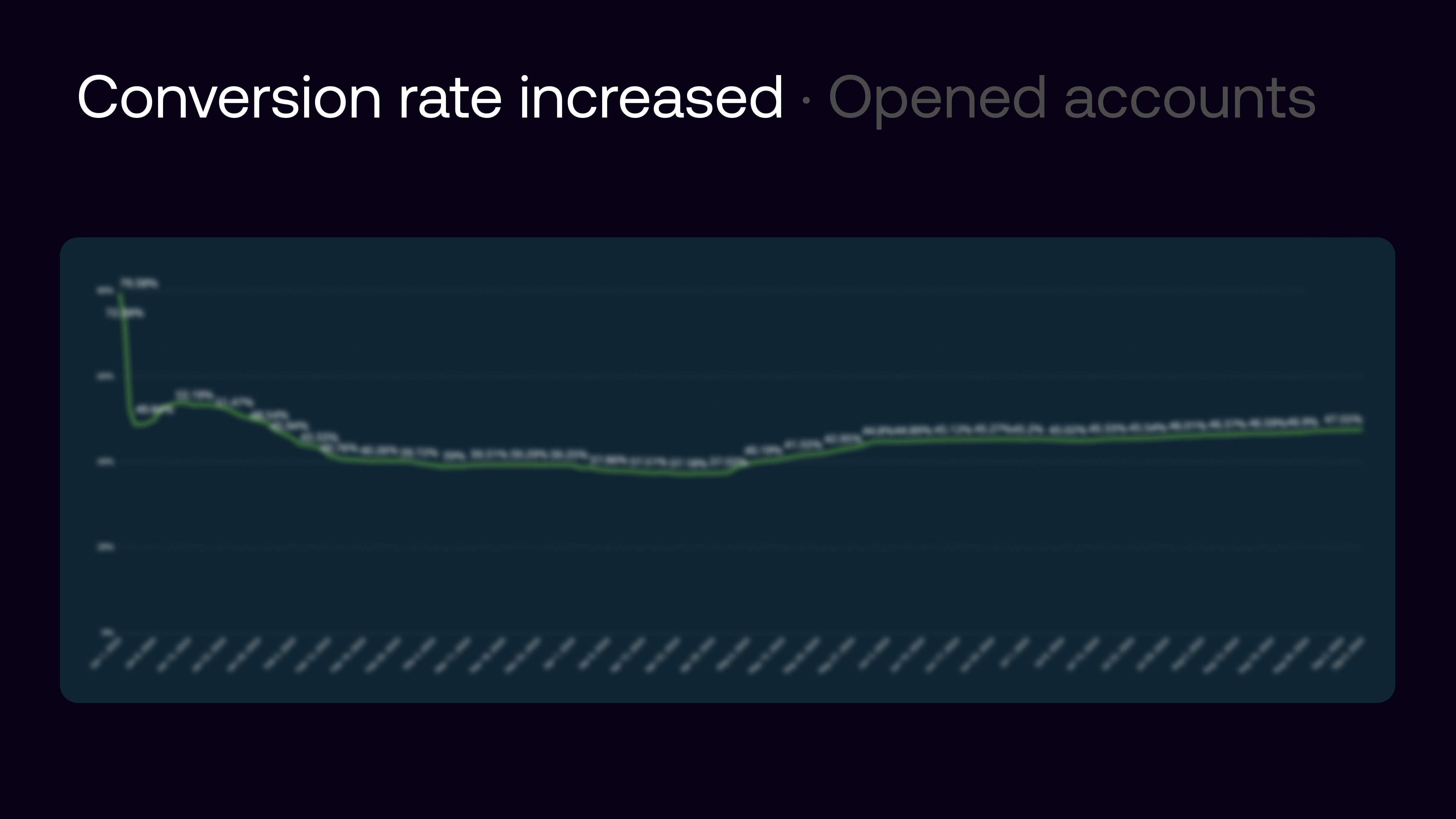
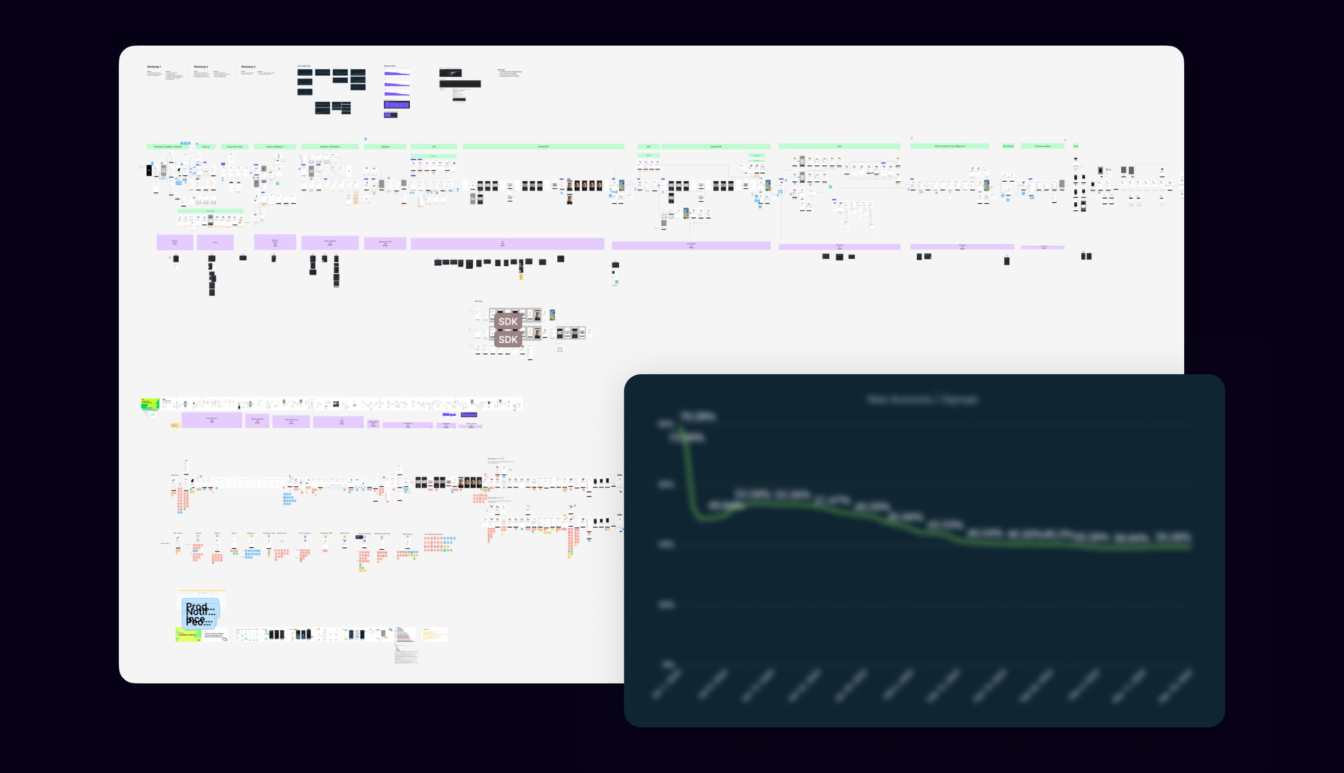
With the onboarding tribe and a senior product designer, I ran a design-led programme that tied funnel data, user testing, customer service and competitor benchmarks to a single prioritised roadmap. Once the prioritised improvements were in market, onboarding conversion improved by 28%; completion within 15 minutes rose from 40% to 57%, and within 48 hours from 80% to 90%. The outcomes section below shows the same trends in the charts.
Shipped work covered identity and compliance journeys, a structured new-user checklist, and iterative UX alongside product and engineering. On the highest-leverage flows we ran structured tests; several variants delivered clear lifts on activation and downstream value before we rolled the winners out more broadly.
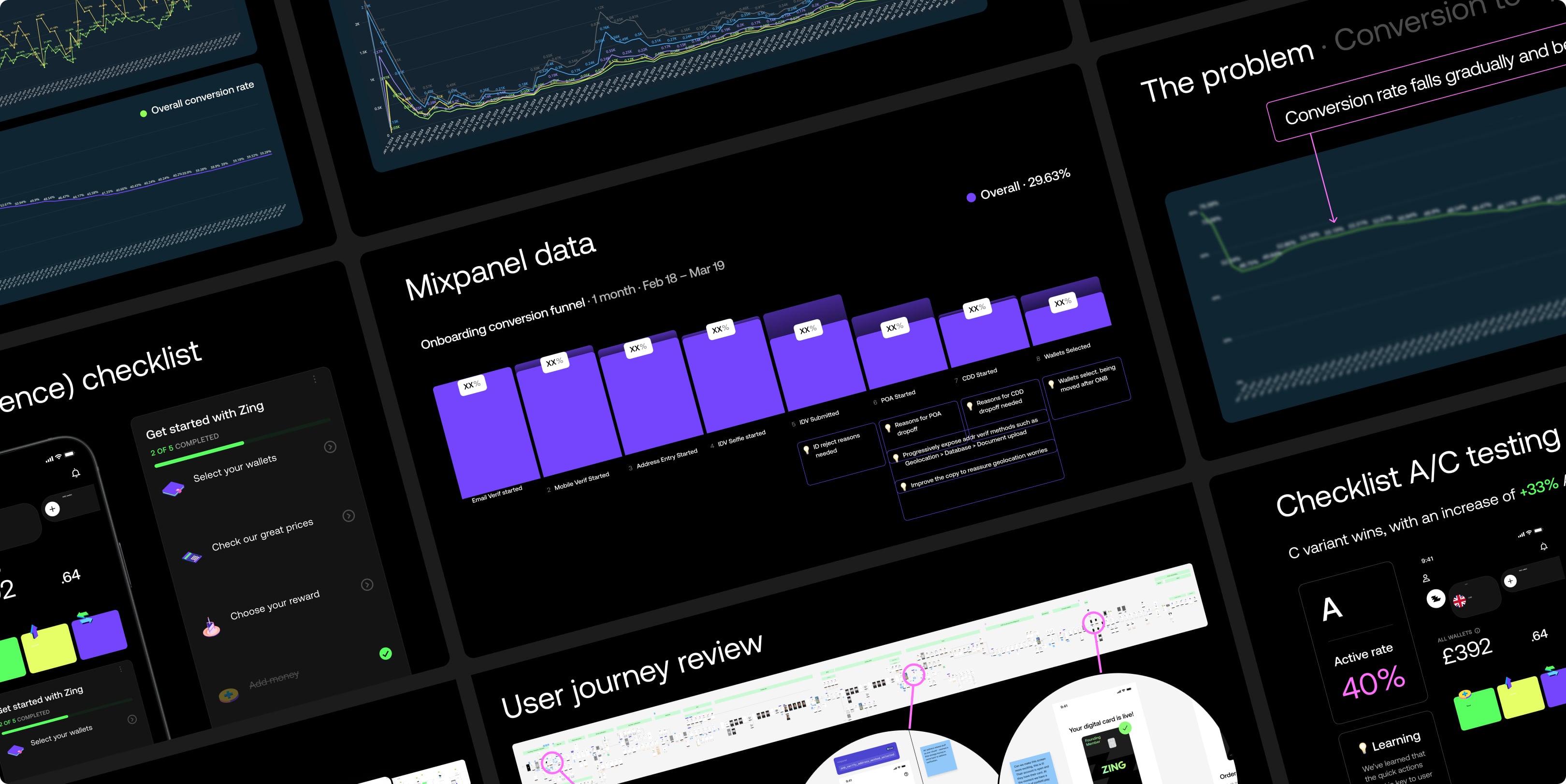
I facilitated cross-functional workshops with the onboarding tribe, data, research and product design to deep-dive the journey and funnel: where users dropped, what the business saw in sign-up conversion, and which problems were worth solving next. The slide captures both the journey canvas we worked from and the headline conversion trend we were responding to.
Success depended on the same people who could change instrumentation, policy interpretation and UI together: research, the onboarding product team, mobile and backend engineering, and data/BI.
User research, testing readouts, and qualitative evidence that we could line up with funnel data.
Product ownership, backlog and tribe rituals—where design proposals turned into sequenced delivery.
Shipping flows, integrations and fixes—and keeping analytics trustworthy at each step.
Funnels, dashboards and deep dives so we debated numbers once, then acted on the same truth.
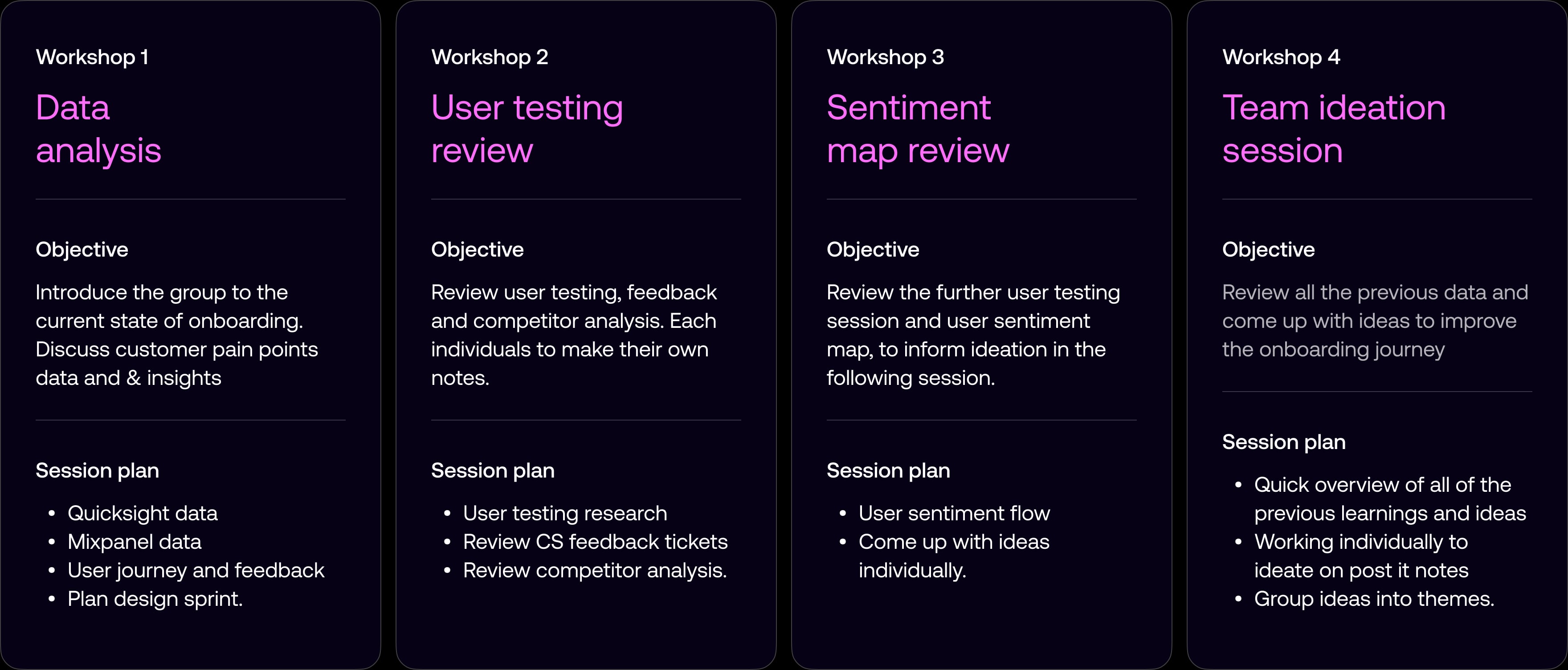
I structured onboarding work as a series of four workshops so the squad moved from shared data to ideas everyone owned: first aligning on Quicksight and Mixpanel with journey context; then reviewing user testing, CS tickets and competitors; next replaying the sentiment map to prime ideation; and finally consolidating learnings into themed opportunities. Each session had a clear objective and session plan so time in the room translated straight into the affinity map and RICE scoring that followed.
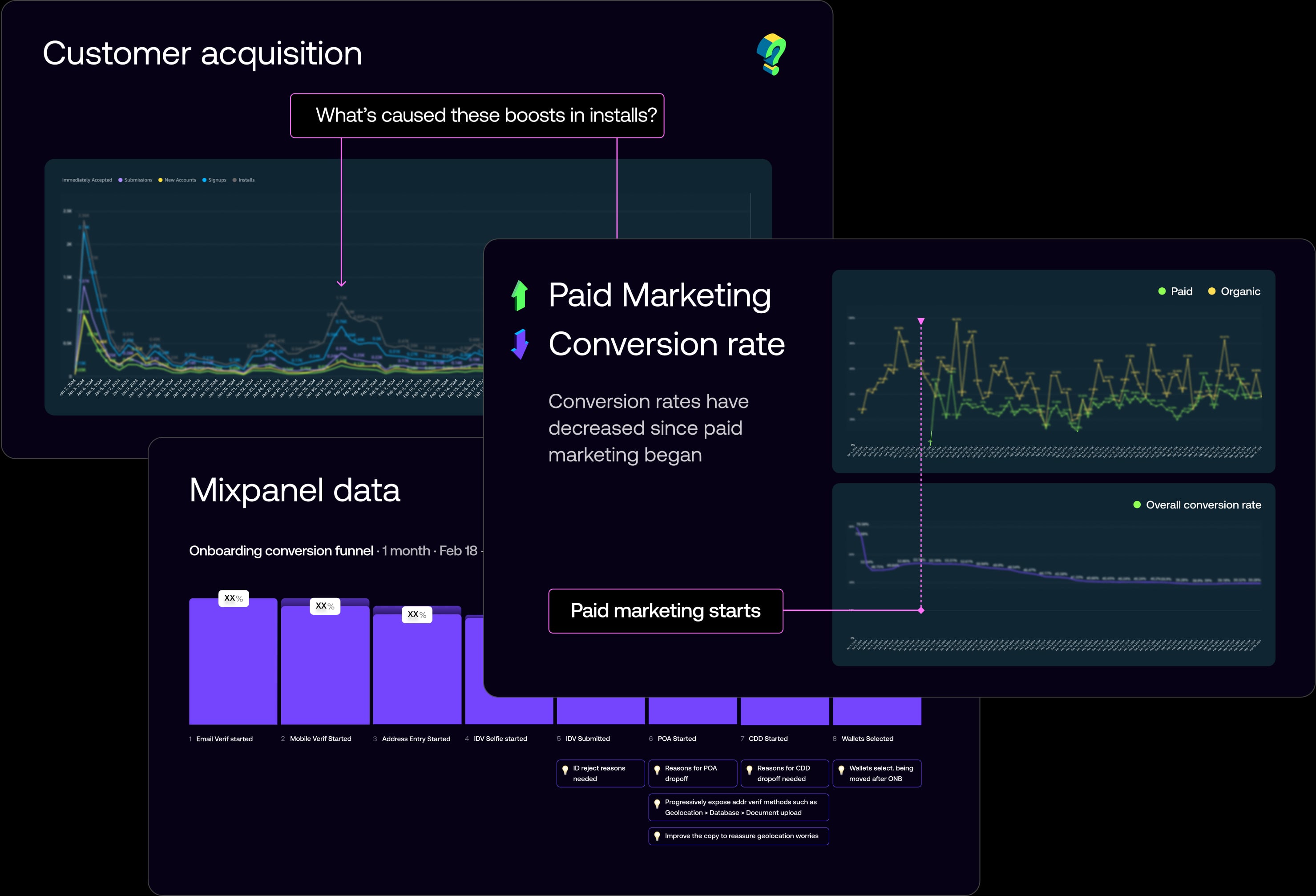
We started from a shared read of the numbers: acquisition spikes and channel mix, how paid marketing related to headline conversion, and the Mixpanel funnel step-by-step (where IDV, POA, CDD and wallet creation hurt most). One composite slide kept the team aligned on what the data said before we argued solutions.
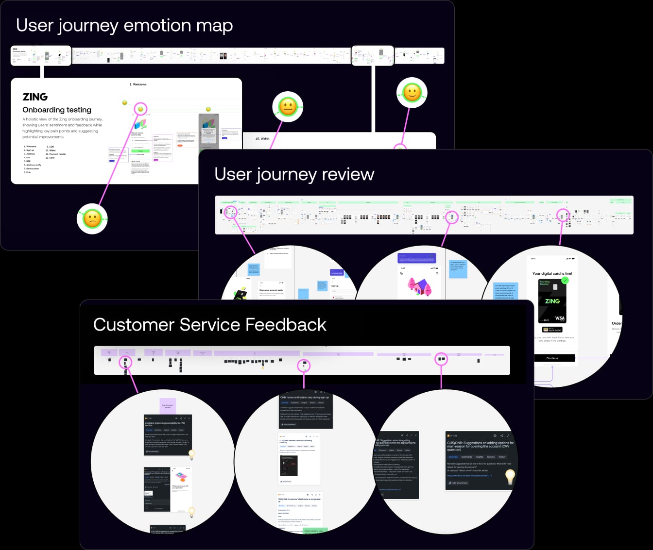
Three workshops walked the end-to-end journey: collaborative journey mapping with sticky-note critique, a sentiment map from onboarding testing, and customer service feedback plotted against stages so operational pain matched UI reality. Qual evidence sat next to the funnel instead of in a separate deck.
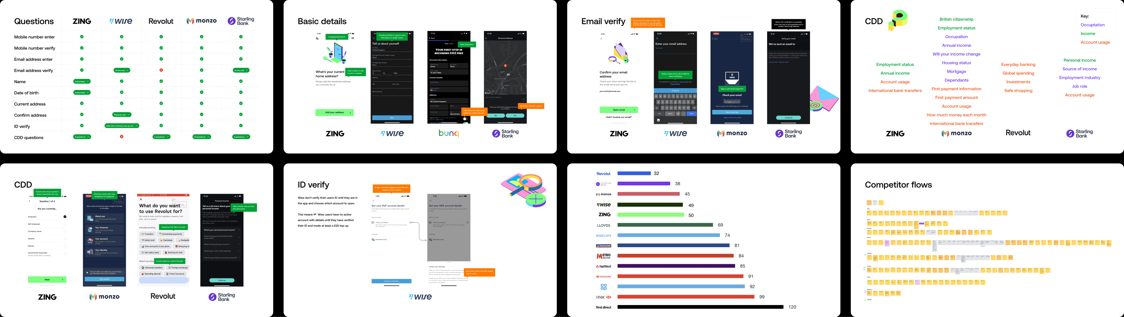
We benchmarked onboarding depth and friction against Wise, Revolut, Monzo, Starling and others—question-by-question matrices, UI comparisons for basics, email verify and CDD, IDV patterns, quantitative step-count bars, and full flow maps. That gave us a shared language for where Zing was heavier or lighter than the market.
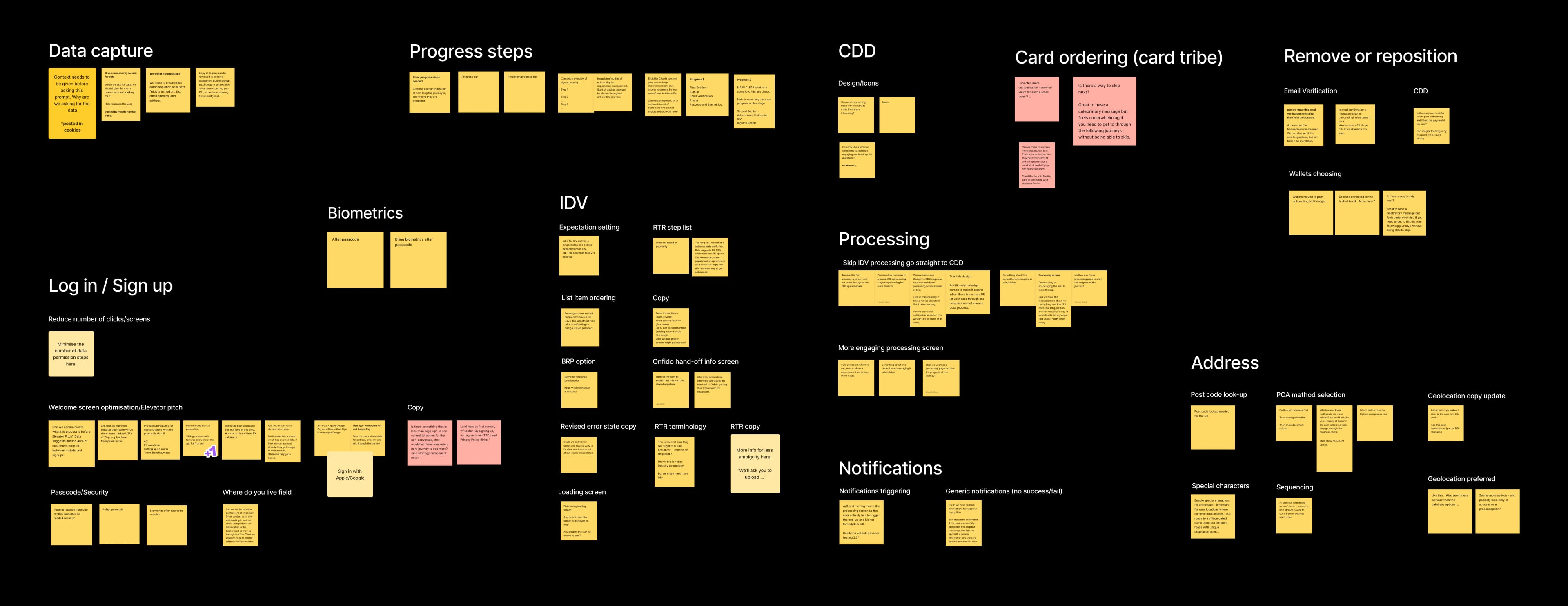
Workshop output and research themes were grouped into clusters—sign-up, IDV, address, biometrics, processing, CDD, notifications, card ordering and remove-or-reposition ideas—so we could see volume and overlap before anyone wrote a Jira ticket.
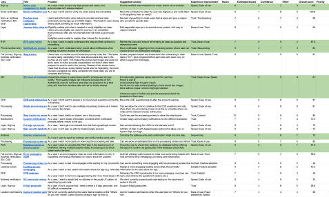
Every idea was captured as problem, solution and rough UI where helpful; the team scored each with RICE (Reach, Impact, Confidence, Effort) and rolled results into a ranked table that fed the onboarding tribe roadmap—transparent, debatable and tied to user and business outcomes.
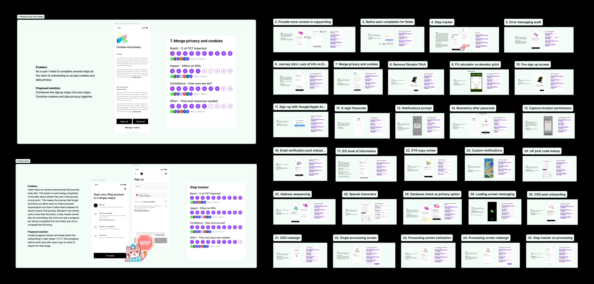
As a team we then voted on each idea to capture a RICE score for Reach, Impact, Confidence and Effort.
By scoring and ranking the top 30 ideas the team was able to focus on the most impactful improvements, which were then integrated into the onboarding tribe’s product roadmap.
This process helped ensure the enhancements were data-driven and aligned with both user needs and business goals.
After we shipped several prioritised improvements, we saw a marked increase in conversion rate—including the 28% lift on opened accounts—and time to onboard came down: completion within 15 minutes rose from 40% to 57%, and within 48 hours from 80% to 90%. The charts below show those trends in the metrics.