As the only physical Monese brand touch point our customers interact with every day, our debit cards are one of our most important assets. While thinking through our new brand positioning and planning out a new product pricing update, we saw this as a great opportunity to redesign our cards to help represent the new plans, improve our brand appearance and product offering to customers.
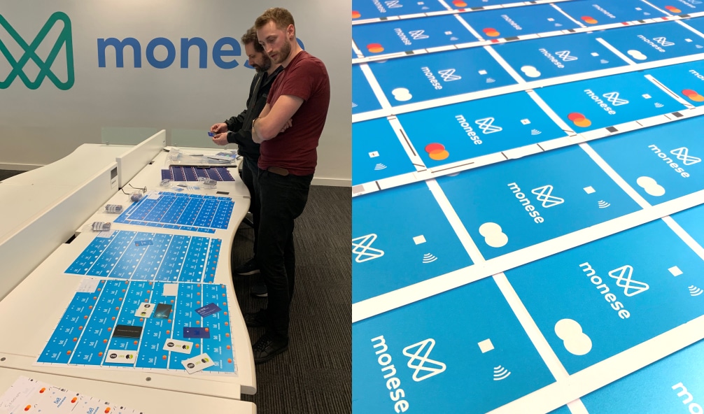
I lead the redesign of our new debit cards, working as the sole designer. The project required careful and vast stakeholder management as the debit cards are such a key brand asset of which there are a lot of strong internal opinions. The project also required a lot of close collaboration with our card manufacturer to push the boundaries of what was possible in terms of the printed finish and paint texture. Once the design was sampled and agreed, I worked with our manufacturers over an extended period to ensure the final quality was carried out through all stages of the manufacturing process.
My Role
Card range design
And stakeholder management
Manufacture research
Collaboration and sampling
Quality assurance
Stage by stage decisions
Having redesigned our card system around a year ago, we now saw the cards as having a slightly different purpose; to give each price plan its own identity, and reflect the progressive value we offer through each plan. With this in mind, we started to consider how the cards could work differently.

For our previous UK account cards we were using our brand secondary colour which is a vibrant green, with a little added blue to take away the grassy hues that can come with some shades of greens. Whilst our Monese green renders well in screen RGB, it was really struggling to maintain its aesthetic in print over a PVC base of the debit cards.

We tried various custom Pantone mixes, and a range of intensities to add more ink to the base, without losing any reversed out elements such as the Monese logo and contactless icon. This helped the colour to an extent, but we still couldn’t match the same level of vibrancy which makes our Monese green stand out.
Although we heard positive feedback from many customers about our green UK account cards, we also received some negative comments that only reflected our own thoughts on the appearance of the green. We knew we had to make some bigger changes.
Observing each day that when customers use their Monese card, they usually hold it vertically. Whether it’s being waved over a contactless reader, or sliding into a chip & pin/ATM machine, our cards are most often held in portrait. Combining this with the fact that horizontal cards with embossed numbers were originally designed to meet the needs of obsolete card reading technologies; we decided to explore a vertical orientation for the design. After some initial testing internally with employees and externally with users, we saw some real excitement for the new designs, and decided to commit to the new orientation.

Simplifying the design was one of our main aims. I looked at ways we could change or remove the coloured shapes from the fronts of the cards, but I wanted to further simplify the design and remove what I could. This led me to move all the personalisation to the back of the card, leaving the front very minimal. Also adopting the new simplified master card logo to remove yet more elements from the design.
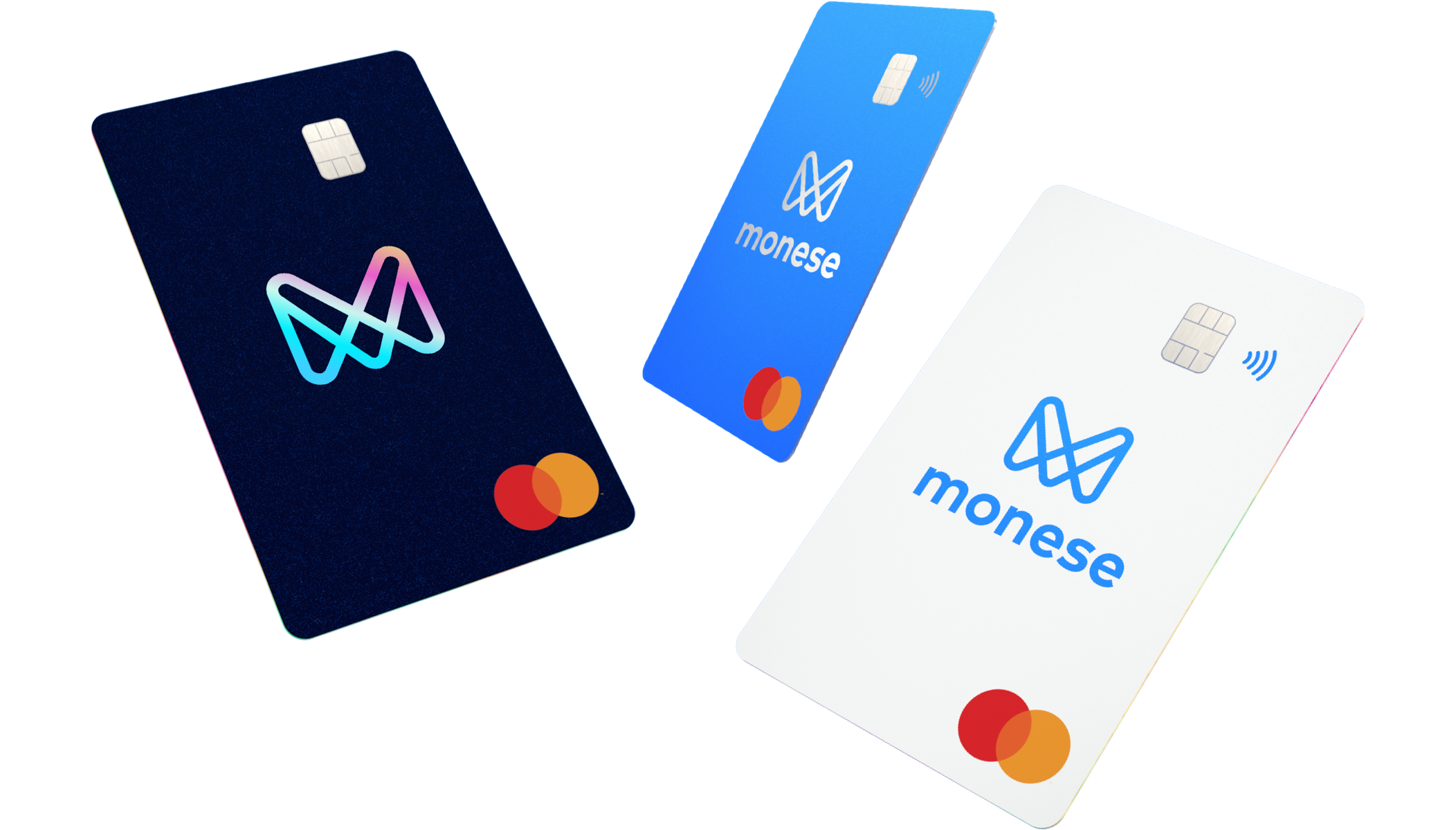
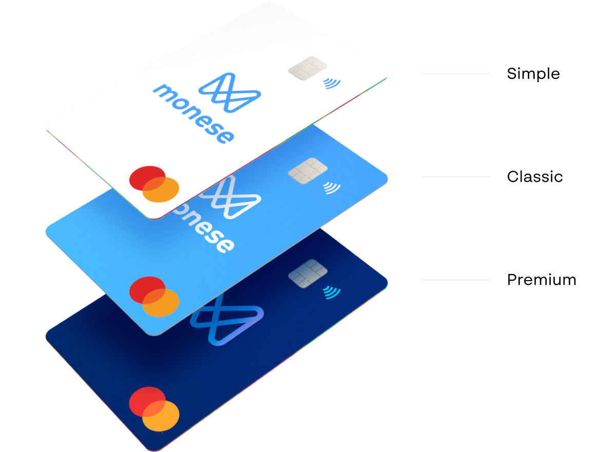
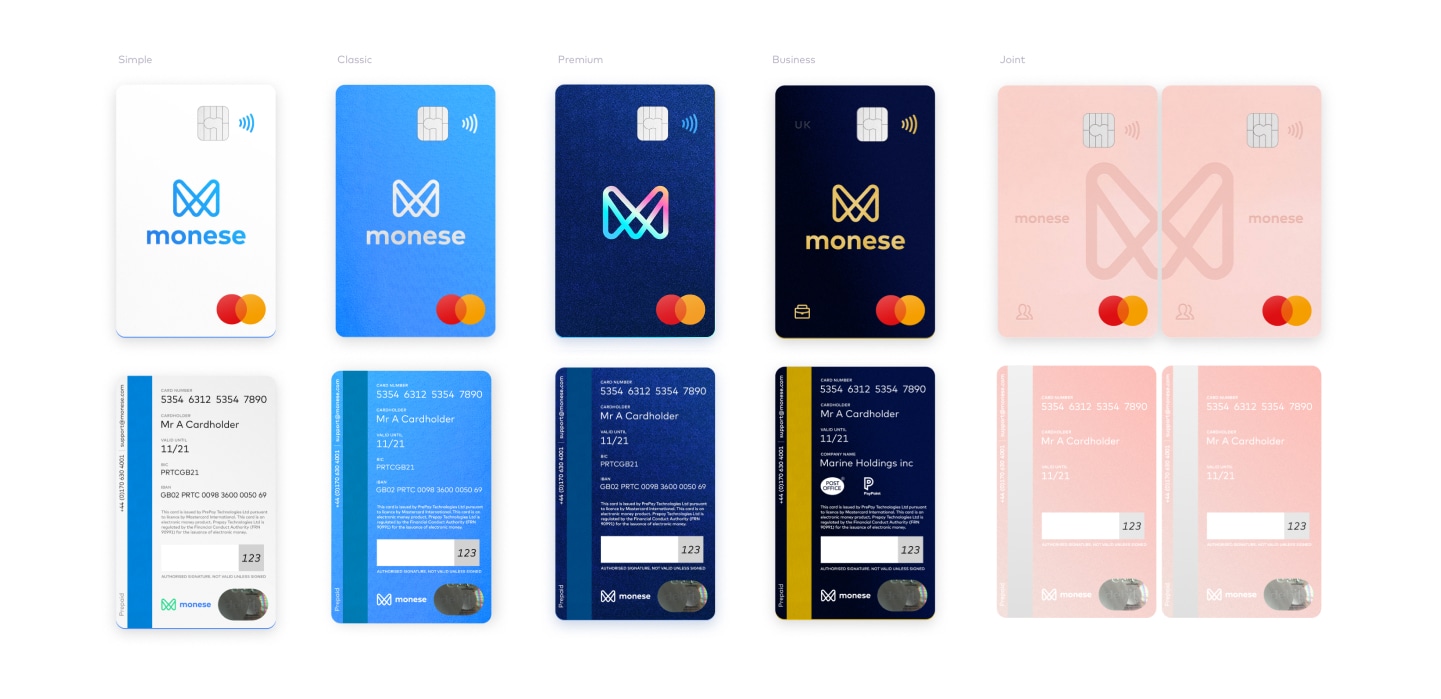
Our new cards represents each of our three product price plans. Simple, Classic and Premium:
With a bright pearl base, and a shimmering metallic Monese logo, our simple cards glisten with a little extra magic.
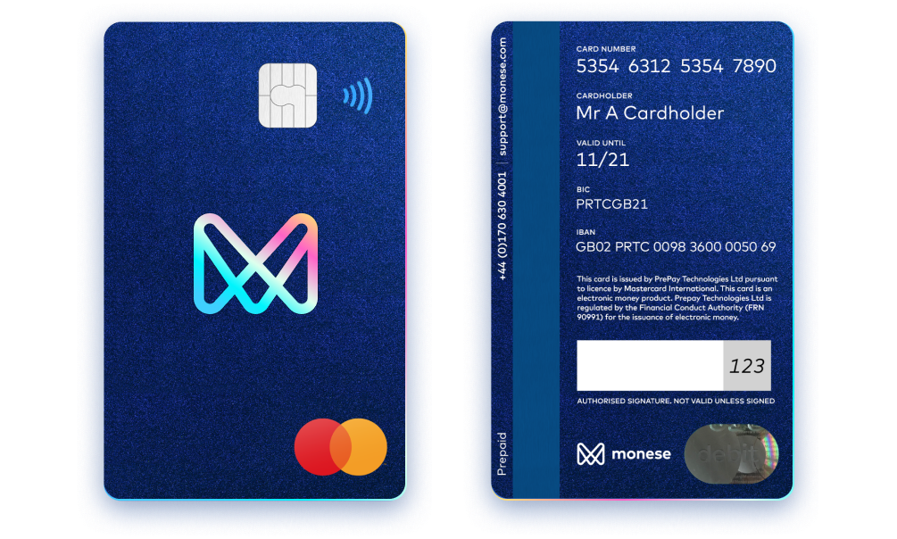
Proudly painted in our trademark Monese Blue over a pearl base coat, our classic cards have an added layer of depth and vibrancy. Combined with a matching silver foil for the Monese logo, card edging and magnetic strip, these cards stand out with elegance.
Shimmering in a deep dark midnight blue, glows a sapphire like gem of a Monese brand icon. The gleaming edges and textured sparkle of these cards radiate luxury.
I created a system that allowed us to introduce new card designs in the future that would be able to follow a consistent look and feel, but have their own unique colours, foils and currency signifier using spot varnish. This allowed us to plan for the future with other cards that we might launch.
Most of my previous current skillset fell within digital product design and UX, although I have an early print background. Having designed the cards digitally, my next big challenge was to achieve this in print and match the digital vision as close as possible.
I rode a learning curve, testing a series of printing techniques including: Pearls & Silvers, screen, CMYK, litho, custom Pantone mixes, glitters, premium metallics and foil inlays. I ran a range of samples on the press for each card until we could settle on an outcome we were pleased with.
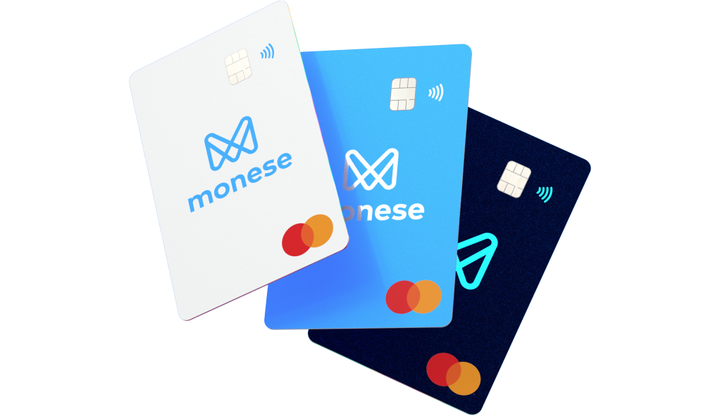
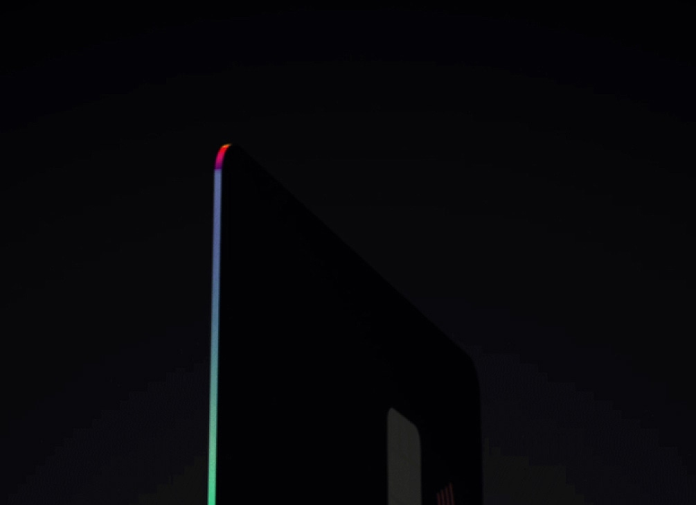
Each card has its own metallic printed edging, lending itself to each design. Our Classic cards feature a matt silver edging that runs as a consistent silver and blue theme through the classic design. Our Simple and Premium cards feature a distinct holographic edging which glistens to complement their contrasting backgrounds.
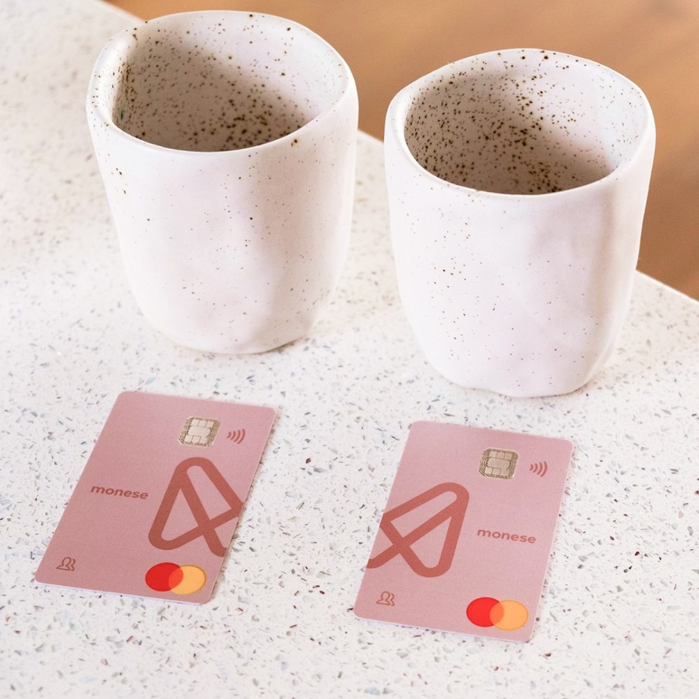
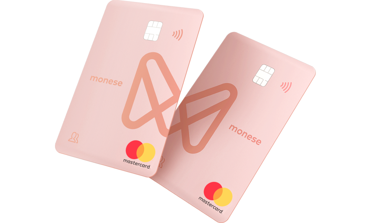
After launching the new set of personal account cards, we later launched a new joint account product to allow couples to share their finances. I created an adapted layout of the virtical design to create a pair of cards that fit together to form the Monese logo. The concept behind this was that customers could “Monese together” when they open our joint accounts.
The design of the cards was well recieved by customers, one of which mentioned in a user testing session that he was drawn to the design so much that he wanted to frame them and put them up on the wall in his house!