Next
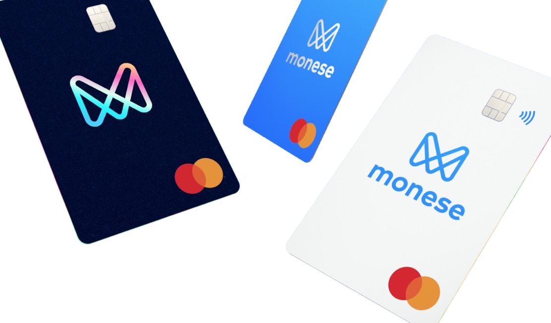
Monese Debit Cards
In my role as Product Design Lead at Monese, I worked with the design team to build out a system to improve the speed, efficiency and consistency of our distributed product team structure. As a design team, the system allowed us to spend more time and energy solving new customer problems, while building on top of our existing solutions.
As I scaled up the design team and our product process matured, we gradually built out and strengthened our design system to allow us to work efficiently at scale. We needed a strong Design system for many reasons, mostly to prevent new designers and engineers unkowingly spending time redesigning and building out solutions to which we had already solved for.
My Role
Initial foundations
Icons, components, illustrations
Process setting
And running weekly meetings
Design direction
Quality and consistency
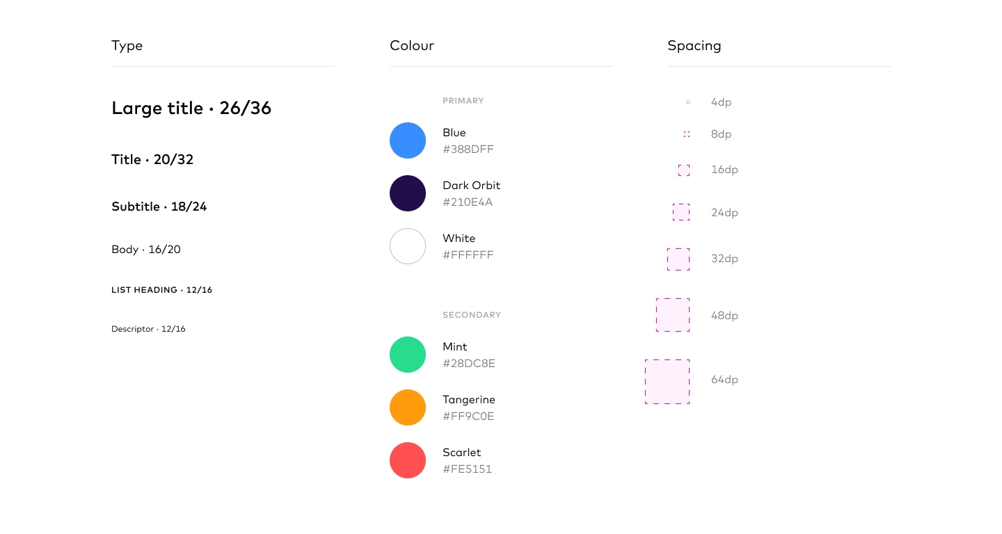
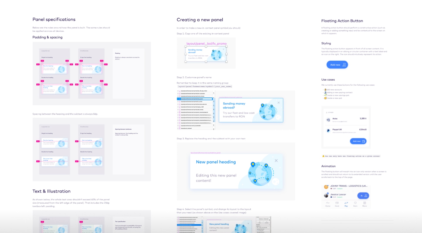
At the heart of our system are a set of foundational elements and values which form the basis of all the other parts of the system. These foundations consist of a typography and spacing scale that’s based on a multiplier of 4, and a colour library that contains a range of swatches. Our palette can be used to communicate a variety of common UI states in a clear manner, while remaining true to the unique Monese brand style.
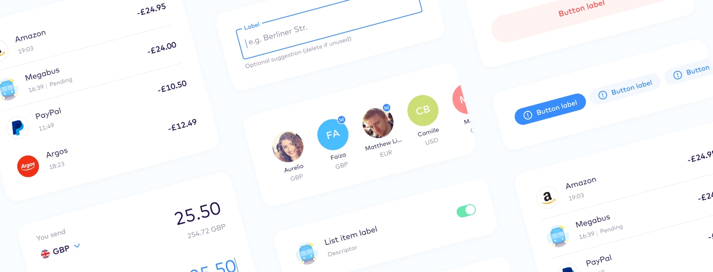
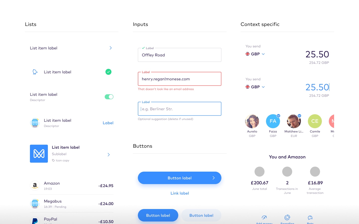
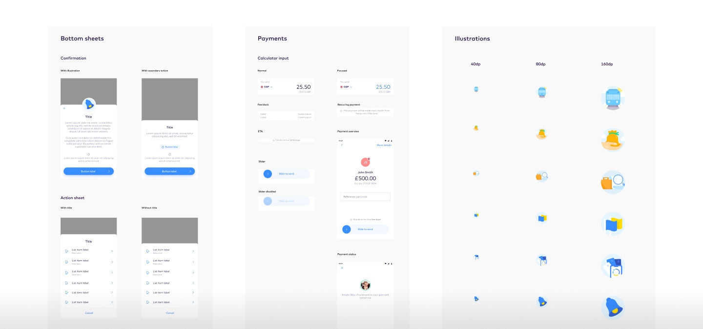
Working with our design foundations, we built a large set of grouped elements that are frequently used to solve UX problems within the interface. We call these groups components, and we arrange them together in the order of the function they serve, such as to show List arrangements or to gathering user input, and the context they’re used, such as within a payment flow or a financial transaction information screen.
These components can then be re-used by designers and developers on the team, to help keep our workflow fast and consistent by avoiding the redesign and build of solutions we’ve already solved for.
We approach our design system as though we’re building a product for our own team to work with. We chose to arranged our components into a series of seperate library files within Figma, because this makes it easier for designers to search for and find each component more easily within it’s relelvent library. It also helps to ensure the libraries maintain a sensible file size that can be easily maintained.
Components, Icons, Core screens, Illustrations, Typography and other libraries, each have their own seperate file which is linked to a central Design System project within Figma. All of the master documents used by our distributed product teams then reference these libraries to design their products.
While defining the system it’s been essential to create and maintain a set of documentation libraries. We use a platform called Zeroheight to build out and store out documentation so it can be shared easily through a web link internally and externally with our partners.
The documentation process has been especially useful for new joiners to the design team, helping them get up to speed quickly and learn how the sustem is used. We also use the documentation to help articulate our agreed outcomes and decisions from weekly Design System meetings to ensure everyone is on the same page about how we intend to approach certain solutions and work with our assets in a consistent way.
The Design System is a living and breathing part of how we work as a design team, and we keep it under frequently review to ensure it can adapt and change to include the latest approaches we’ve taken, and keep up to date. One of the key parts of our weekly team process is our Design System catchups every Friday afternoon.
We keep an agenda building throughout the week as we discover items we need to cover and discuss. Then on Fridays after lunch we come together as a team and cover off all the aspects of the system that need to either change, be added, consolidated, removed, discussed or documented. It’s also a great opportunity to end the week as a team, having made plans to start the next week with a stronger system and design process than we began with.